With the increasing popularity of online shopping, it has become more difficult for companies to attract and retain loyal customers. If you need high conversion rates, you will need to pay close attention to user experience in interacting with the site, as visitors who are satisfied with it not only buy more often but also return to your site in the future.
Intro
Magento is a very popular and multi-functional open source e-commerce platform. In general, this site engine is used by more than 100 thousand commercial sites on the Internet throughout the world. Easy to use and having a large number of settings, it continues to receive more and more support among web designers and owners of commercial websites. In addition, Magento themes are fully customizable and ready to meet user requirements, allowing them to create and launch a full-featured online store within a few minutes.
However, managing successful e-commerce is a big challenge. Each landing page should be directed to a specific target audience, grab their attention, keep them involved, and eventually turn into your customers. As competition increases, the purchase funnel becomes more and more difficult every day. Therefore, in this article, I have prepared tips with the help of which you will be able to increase the level of trust, improve customer experience and generally increase the conversion rate of your existing online store based on Magento.
Improve Perception By Clear Navigation
When a visitor can do what he wants to do on the site without much effort or interruption, this means that the site is intuitive. It seems simple, but very few sites are intuitive. When a site (or even just one small element of a site) is not intuitive, UX suffers. Navigation, of course, is vital in helping visitors find the products they are looking for or want to buy. If the search process is not intuitive, visitors will go in search of more convenient navigation. At the very least, they are less likely to return to make a second purchase.
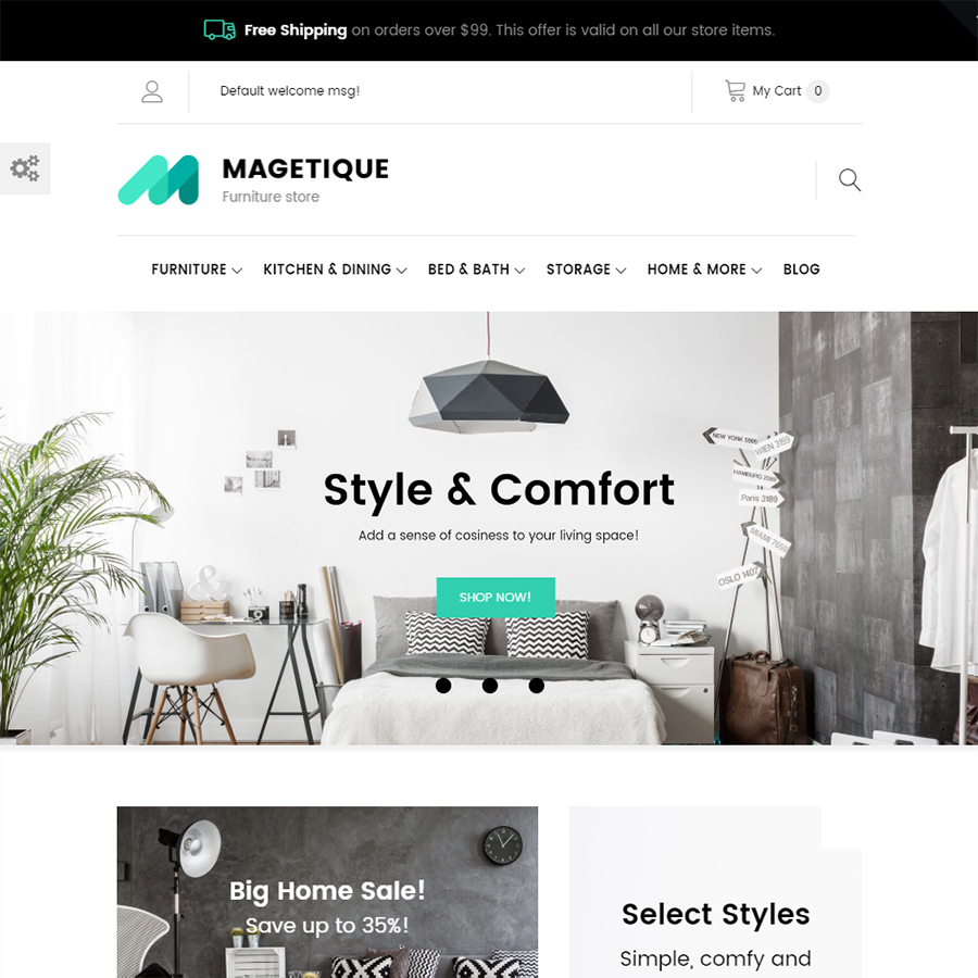
The purpose of the menu is to show the user the main sections of the site and make navigation easier. When compiling a list of sections, you should avoid unnecessarily complicated or obscure titles. Just like it's done in this Magetique theme: easy, understandable navigation and notable search.
Magetique - AMP-Ready Multipurpose Magento 2 Theme
If the page the user is on is irrelevant to his goals, UX design should tell him where to go for the right content. Some tips to better the navigation:
- Fix the navigation bar at the top of the site.
- Do not create a large number of links on the navigation bar.
- Make categories and subcategories clickable.
- Add points to determine the location.
- If you have a wide selection of products, use mega menus.
Use Live Photos
According to the Bright Local survey, 23% of potential customers are more likely to get in touch with a company that shows the faces of its employees. People are interested in people: live photos, real stories, and results. The market is oversaturated, customers are selective. Be open if you want them to choose you.
Put yourself in the shoes of a potential client - this is the simplest and most obvious technique, but it's rarely used. What touches you, why do you buy a particular product or service? What prompts you to pay faster? What causes you to become a loyal customer? Avoid using lifeless stock photos that are inappropriate and tasteless. Skyword research showed that if the content includes interesting images, you will receive on average 94% more views! Just look at those bright and not ordinary pictures used in the multipurpose Flash theme.
Flash - Multi-Purpose & High-Performance Magento Theme
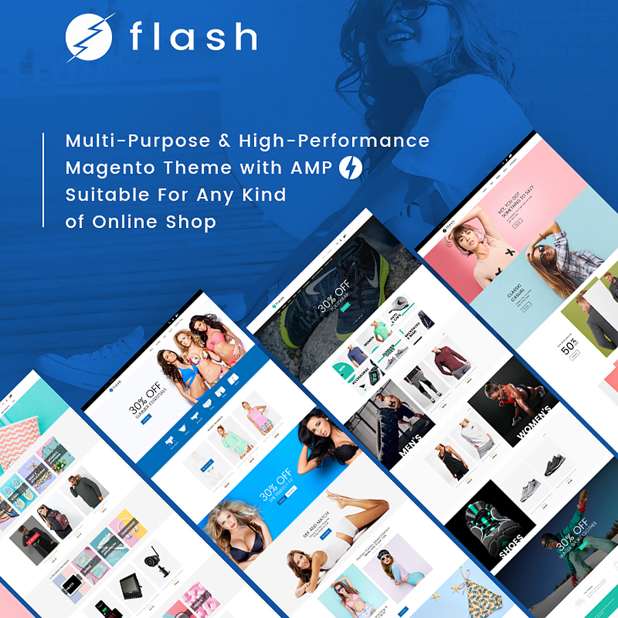
All of its 8+ layouts attract attention because of the interesting photos which give real-life emotions. And for e-commerce, it matters a lot.
Watch a short video on 6 Digital Marketing Trends of 2019
Pay Attention To Mobile UX
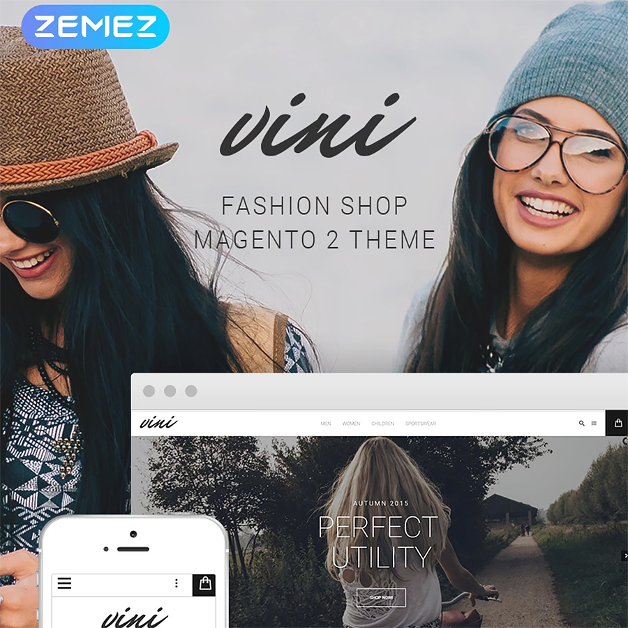
What happens when visitors come to the site from a mobile device? If you have a good UX for the desktop version of the site, this does not mean that the mobile UX is one of those. Mobile UX is a completely different animal. The realization that people want something very different on your mobile site than on a desktop version is more than half of the success. This will put you ahead of the competition. As a good example, you can look at Vini - a fashion shop Magento theme. In addition to all other premium features, it is fully responsive and looks good on all devices.
Here are a few things to keep in mind when designing mobile e-commerce UX:
- Make the user experience natural, native. Most mobile e-commerce sites do not have the option of enlarging product images through broadening or double-click.
- Choose the right keyboard. Do not use a traditional keyboard if you know that people will enter numbers, for example.
- Disable autocorrect during checkout. There is nothing more terrible than typing an address three times on a phone.
- Make sure that users can save their carts.
- If you can reduce the number of clicks needed to perform an action, do it.
- Pay special attention to quality assurance and cross-device / cross-browser testing on mobile devices.
- Allow customers to save information for future visits, reducing the amount of information they need to enter on mobile devices.
Use Negative Space
Negative space is the gap between large and small elements of the site. It includes the space between letters, lines, and design elements. Space is negative, but its role is extremely positive. It focuses the user's attention on the essentials and makes it easier to perceive the information you need.
If you pay attention to all forms of negative space on the site, you can make it more legible and easily perceived by visitors. And of course, all this leads to an increase in conversion. To make it more clear for you, pay attention to this computer store Magento theme.
Computer Store
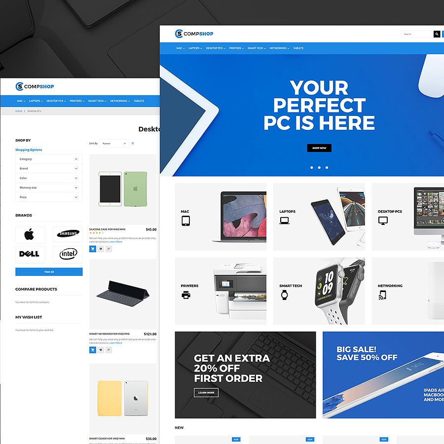
It has a lot of elements and at the same time, the negative space makes all the pages breathable and light.
Create Comfortable And Not Overloaded Web Forms
This applies to registration, request, and other form elements (title, characteristics, button). Place them far away from other elements on the page. People often switch attention. This technique will allow visitors to quickly perceive the information and will push them for a positive decision. In addition, users should be able to easily enter information about their credit card, specify the delivery address, see the price of each product, use autocorrect if applicable. The quick purchase option without registration will be useful.
In the case of web forms, this fashion store theme called EVA will be just a perfect example.
EVA - AMP Fashion Store Magento Theme
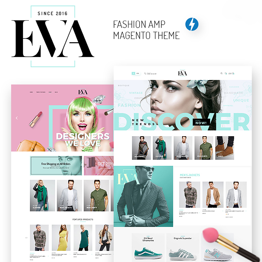
The Magento theme uses not only simple web forms but also very stylish design for them.
See how important all the web forms are. If used smartly, they will help you to involve clients and make them stay.
Watch short Magento tutorials videos
Don’t Forget About Simplicity
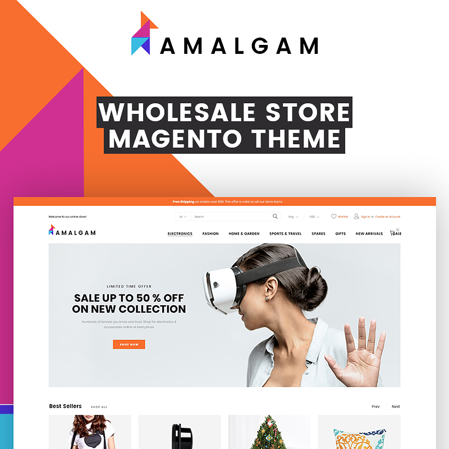
Simplicity means a lot when it comes to conversion. Every time you create a page, ask yourself: "Can you make it easier?". The result will be more aesthetic, and the conversion - higher. Simplicity is more than limiting choices. This is about creating an uncluttered overall design that minimizes distractions. The main idea is the fact that people can perceive only a limited amount of information at a time. If we see too many elements on one page, then our attention is overloaded. Amalgam is one of Magento themes where design simplicity stands this theme out of others. Just look at the landing page, there are two main words to describe it - uncluttered and stylish. To look more closely at Amalgam, click the link above.
Amalgam - Wholesale Light Minimal eCommerce Ready-to-Use Magento Theme
Remember that creating a positive experience of interacting with your site means getting rid of everything that is not absolutely necessary.
Form A Clear Hierarchy
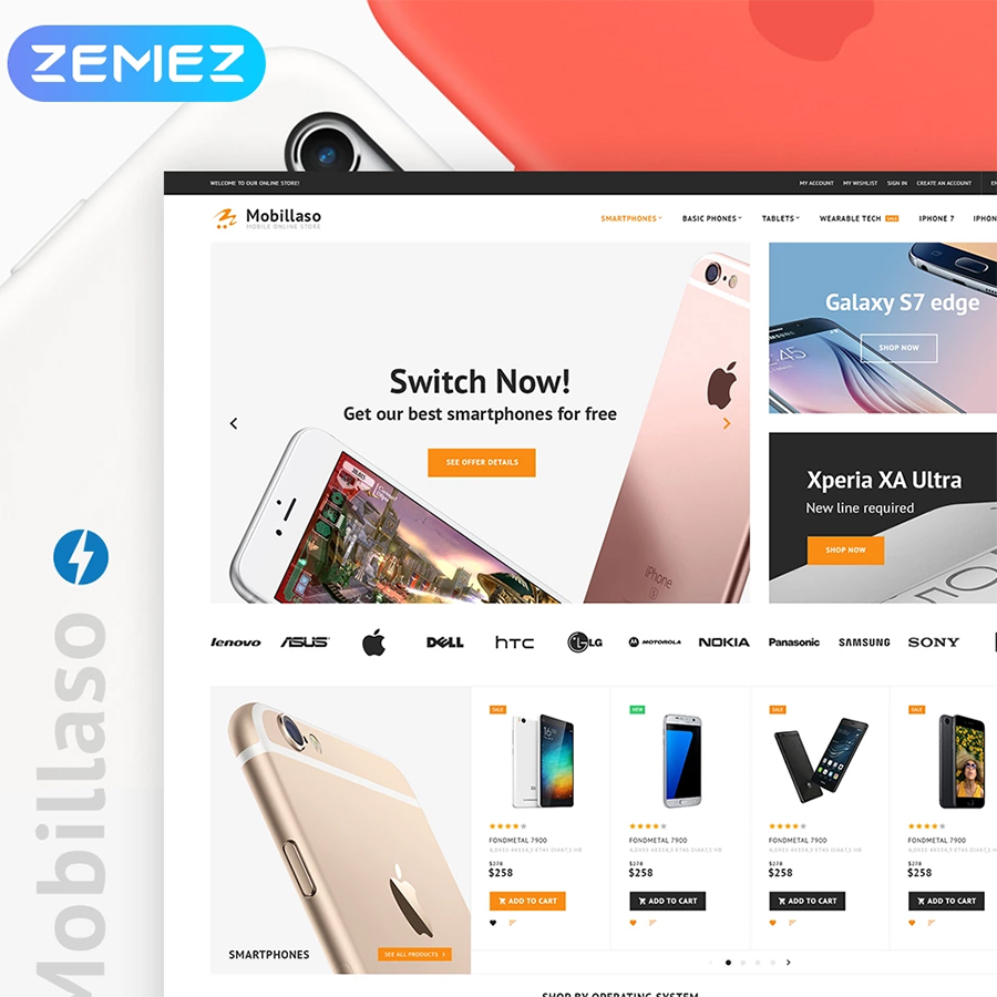
Scattered elements are confusing and make the visitor to leave the site. Compose information so that a potential client can distinguish the important from the secondary. In order to make the element more powerful - increase its size, brightness, add animation. To see a good example, pay attention to this mobile store Magento theme. Each section is in its place. All blocks are arranged in a clear hierarchy. Photos of goods due to the brightness and sufficient size of images immediately attract attention, prompting the visitor to open the next page. The theme is created to be a successful site.
Mobile Store Magento 2 Theme
The visual presentation of any site should answer the questions: What is it? How can I use it? Why do I need it? Make sure that your site answers all of them.
Final Word
There are thousands of resources that create mind-boggling graphic and interface design and use the services of the best professionals but can not take a decent place in the network. And all because the interaction between the site and users suffers. If the mood of the client after visiting your site is worse than before, then your business is at risk. And it is UX design itself that can change the situation. If you really want to increase conversion of your Magento-based site, get into UX design and use the tips mentioned above. With excellent UX design, users will definitely remember your web resource and would like to revisit it. And this will have a positive effect not only on the traffic but also on the business as a whole.
